
Choice Versus Usability
Unlimited Choices Are Good … Right?
By Scott Kasun
“Yeah, but your scientists were so preoccupied with whether or not they could that they didn’t stop to think if they should.”
–Ian Malcolm, Jurassic Park
When I was a kid, you had four choices when it came to watching television: NBC, ABC, CBS and PBS (which only dads watched, much to the chagrin of the children). Cartoons? You had a brief window early Saturday mornings to get your fill of Bugs and Fred. It’s no wonder we spent all our time outdoors.
We didn’t know we needed more channels until much later, when one of my neighbors got (cue angels singing) … cable.
 Whoa. It was mindblowing. Yes, you had to get up and manually punch those buttons – the cord was never long enough – but dammit, man, look at all the channels! 37 options? Crazy!
Fast forward to today, when a typical cable TV subscription has more than 200 channels, despite the fact that most people only watch 12.7 channels. But it’s still not enough – we need more movies, more original programming, more Jennifer Aniston all. the. time.
The same thing has happened to radio, with virtually the same path. Gone are the days of listening patiently to the local rock ‘n’ roll station (shout-out to QFM96, still going strong), waiting with your portable tape recorder and hoping they would play the just-released Van Halen song. No longer will your Camaro be cluttered with 8-track tapes, cassette tapes or even CDs. Nope, just tune into satellite radio or stream your “all-time greats” playlist; annoying songs and terrible commercials are a thing of the past.
It’s amazing how much technology has come and gone, just in my lifetime. And it’s all for the greater good, right? We have more choices than ever before, which means things are better and people are more content, aren’t they?
Not so fast, my friend…
We Are At a Technology Crossroads
I own an older car that does not have a satellite radio-compatible deck. I bought Alexa auto so that I can use voice commands to listen to my XM app and stream it through my car stereo. My wife purchased a car that has Apple Car Play, so she can do the same and/or listen to just about every music streaming service (Pandora, Napster, etc.). Guess what? The majority of the time, both of us wind up listening to good ol’ FM radio. Why? Well, in my case, it’s a pain to try and use my phone – and a horribly designed app – to navigate between stations. In my wife’s case, the Airplay connection is inconsistent, and I don’t think she has a playlist within any of the music services.
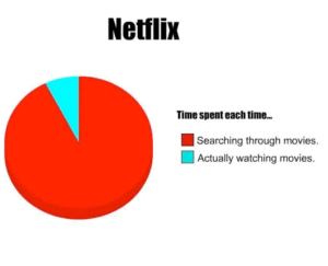
As for TV, the meme says it best. With my Apple TV, I have my choice of three different streaming services, all the free apps and also the paid options via Apple.
And since I live an extremely busy life, when I get a chance to actually watch something, the pressure to pick just the right program is paralyzing (and the pressure increases exponentially with each additional family member).
What Does Any Of This Have to Do With Digital Marketing?
As much as all of that might sound like complaining, I’m thankful for these platforms, as most have spawned additional opportunities for digital marketing. That aside, we as marketers are equally as guilty of striving to provide every choice imaginable to our audience at the risk of leaving anyone out. More and more marketers are getting better at singular home page messaging, but there are still plenty of folks who think nothing of having 10 or more calls-to-action just on the home page.
Website Fails
Take a look at this screenshot:
 This is one version of a WordPress theme that has been purchased almost 175,000 times. This view (on my desktop) is what is commonly referred to as “above the fold.” By my count, there are more than 20 places a user could click, including five actual “call-to-action” buttons (to say nothing of the user confusion from misuse of the action color). What is it they actually want the user to do?
Now, granted, this is simply a theme with dummy data, but I could have visited any number of sites and found the same.
You’ll also see choice overload within site navigation. It’s not an easy exercise, but the top level navigation should be limited to ONLY the most important overall categories. Dropdown navigation should be limited; as visitors find it annoying. Disguising your menu choices via fun or quirky titles is a horrible idea as well (About Us is to the point and easy to understand; X Factor, not so much). Confusing the navigation order is another mistake that we see all too frequently. You should know your visitor’s click path, and the fact that they will investigate your products and services before checking out your awards or getting to the contact page.
At the opposite extreme are the folks who hide their entire navigation behind a hamburger menu. Yes, mobile traffic now dominates search as well as site visits, but why force desktop users to a universally hated menu interface?
Advertising Fails
Websites have a long and rich history of notable failures, thanks to the egregious number of hacks and amateurs out there creating sites. But there are plenty of examples of choice overload in digital advertising as well.
An obvious example: paid search ads that are directed at too broad of an audience. These ads just add to the noise and lead to even more apathy from prospective customers. Couple that with murky calls to action – or, worse, multiple calls to action – and it’s easy to see how amateur digital marketers are making it more difficult for everyone.
Even social media isn’t immune to a heavy touch. For some ungodly reason, Instagram allows up to 30 hashtags in a post. And some marketers seem determined to get close. For the love of Pete, why? I completely understand that hashtags are meant to categorize content and allow users to find content that is relevant to them, but an overabundance leads to overwhelmed users. And an overwhelmed user isn’t likely to do anything you are hoping they will do, like engage with your brand.
The Takeaway
Look, we’ve willingly created our mess. Technology has opened avenues that we never dreamed would exist, and I’d still much rather have 200 channels than three plus the much-disdained old man channel. But it’s also quite evident that managing the plethora of options is going to take better interfaces and more thought – advancements have outpaced user experience.
When you review your site structure, ask yourself how many users suffer from “paralysis by analysis.” Is your digital advertising muddying the water even more, or do your ads cut to the core with laser focus?
Or are your prospects throwing their hands up, and going back to their FM radios?